A Comprehensive Guide
Photography, in its essence, is an art form greatly influenced by colours. Understanding the importance of colour profiles is crucial for both amateur and professional photographers alike. This comprehensive guide will delve into the nuances of colour profiles, their significance, and how to choose the right settings for optimal photographic results.
What is a Colour Profile?
A colour profile, simply put, is a set of data that characterizes a colour input or output device. In photography, this means ensuring your camera, monitor, and prints all interpret colours consistently and accurately.
The Importance of Colour Profiles in Design
The consistency of colours across different devices and prints is paramount. A colour profile ensures that the hues you see on your screen are the same ones that will appear in your prints or on other devices. This uniformity is essential for maintaining the integrity and mood of your work.
Understanding Colour Gamuts
There are several colour gamuts to be aware of:
- P3: Offers a wider range of colours, ideal for high-end monitors and Apple devices.
- Rec. 707/sRGB: The standard for most web and digital platforms.
- EBU/PAL & SMPTE-C/NTSC: Used primarily in broadcast standards.
- Adobe RGB: This color space covers a broader range of colors compared to sRGB, making it suitable for high-quality print work. It’s particularly favored in professional photography and graphic design where color fidelity in print is crucial.
- DCI-P3: DCI-P3 has a wider color gamut than sRGB, allowing for more vibrant and lifelike colors. It’s widely used in the film industry and is becoming increasingly popular in consumer electronics for its ability to deliver a richer visual experience.
Choosing the right gamut depends on your end-use – whether it’s digital display or print. These color gamuts offer distinct advantages for different applications. Adobe RGB is often the preferred choice for print, while DCI-P3 is favored for digital work, especially in video production and display on contemporary screens.
Selecting the Appropriate Colour Gamut
For web and digital use, sRGB is generally recommended due to its wide compatibility. For print or high-quality displays, consider Adobe RGB or P3, which offer a broader spectrum of colours.
What is White Point?
The white point in a colour space refers to the definition of what is perceived as “white” under specific conditions. Common standards are D50, D65, and DCI, each representing different lighting environments.
White Point Settings for Photography
Your choice of white point setting should match the lighting condition under which the final image is viewed. D65 is often used for general viewing conditions, while D50 may be better for simulating a standard print viewing environment.
Choosing the Right Monitor for Photography
Investing in a monitor that accurately displays colours is crucial. Look for displays with a wide colour gamut, high resolution, and the ability to calibrate.
When choosing a monitor for color-critical work in photography, there are several excellent options to consider:
- BenQ PD2700U: This is a budget-friendly 27-inch 4K UHD IPS monitor known for its color accuracy and ergonomic features. It’s particularly suitable for beginners or those with tighter budgets, offering 100% sRGB and 100% Rec.709 color coverage.
- Dell U3219Q: This monitor is a great all-rounder, suitable for color grading, business, and even gaming. It has a 32-inch display with 4K resolution, and provides good color accuracy and ergonomics.
- ASUS ProArt PA32UCX: This is a high-end option, featuring a 32-inch 4K HDR Mini LED monitor. It offers excellent color accuracy, HDR support, and is ideal for professionals focused on color grading.
- Viewsonic VP2785-2K: A premium monitor with a 27-inch display that delivers lifelike colors. It’s suitable for a range of professional applications, including filmmaking, video editing, and graphic design.
- Apple Pro Display XDR: Known for its exceptional color accuracy, the Apple Pro Display XDR features a 32-inch Retina 6K display. It covers a wide P3 color gamut and offers a high dynamic range with a 1,000,000:1 contrast ratio. This monitor is ideal for professional photographers and video editors who require precise color representation.
What is Screen Calibration?
Calibration ensures your monitor displays colours as accurately as possible. There are two types:
- Software Calibration: Adjusts the monitor through its software settings.
- Hardware Calibration: Involves using external devices to measure and adjust colours.
Monitor Recommendations
For monitors with hardware calibration capabilities, the EIZO ColorEdge CS2740 is a notable option. It’s a 27-inch monitor with 4K UHD resolution, providing excellent detail and sharpness for high-resolution content. This monitor is especially suitable for creative work like photography, video editing, and design. It covers 99% of the Adobe RGB color space, ensuring faithful image reproduction. Additionally, it supports EIZO’s ColorNavigator 7 color management software, allowing for regular calibration and quality control for predictable color results.
The BenQ SW270C that features hardware calibration, making it suitable for color-critical work in photography and design. It’s designed to offer precise color accuracy and consistency. This model is often favored by professionals who require reliable color representation in their workflow. The hardware calibration allows users to fine-tune the monitor’s color settings to match specific color standards and personal preferences, ensuring that the displayed colors are true to the original images or design specifications.
Apple monitors, particularly high-end models like the Apple Pro Display XDR, are equipped with features suitable for professional color calibration. These monitors support precise color accuracy with their wide color gamuts and high contrast ratios. However, whether they have hardware calibration capabilities and user-adjustable calibration settings can depend on the specific model. It’s important to note that Apple’s professional-grade monitors are known for high standards in color calibration and management.
How to Calibrate Your Monitor
Calibrating your monitor involves either using built-in software tools or external calibration devices. Regular calibration is recommended to maintain colour accuracy.
For screen calibration tools, the Datacolor Spyder5Elite is a notable option. It’s a hardware calibration tool that ensures accurate color representation on your monitor. Here is a YouTube tutorial.
The Influence of Ambient Light
The lighting in your environment can significantly impact how colours are perceived on your screen. It’s advisable to work in a neutrally lit room to avoid colour casts and reflections.
Does Blue Light Affect Colour Profiles?
Using blue light filters or glasses can alter the perception of colours on your screen. It’s best to avoid these when working on colour-critical tasks.
Colour Profiles in Apple Displays and Computers
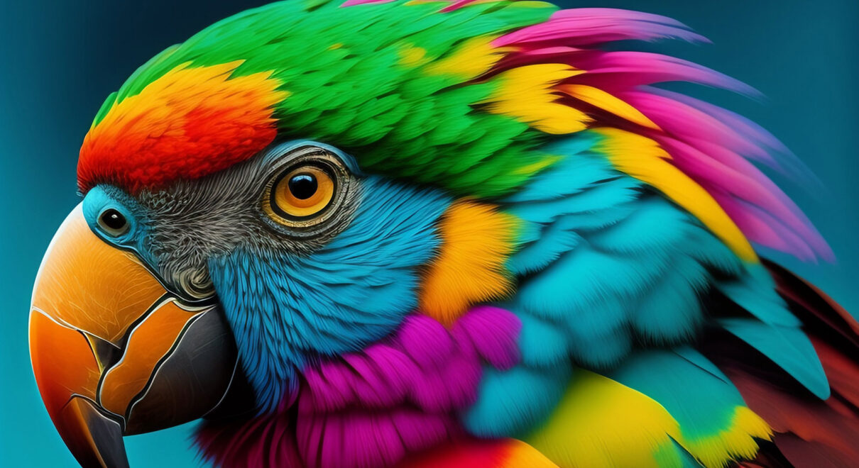
Apple devices often use the P3 colour gamut, offering a wider range of colours compared to sRGB. It’s ideal for high-quality image work, though sRGB might be more suitable for web-focused tasks.
Change your Mac display’s colour profile
In Displays settings, you can switch between different colour profiles. Your Mac selects the recommended profile for your display by default, so it isn’t usually necessary to adjust this setting.
Note: Certain Mac models use built-in reference modes rather than colour profiles. If you have Apple Pro Display XDR, Apple Studio Display, a 14-inch MacBook Pro (2021 or later) or a 16-inch MacBook Pro (2021 or later), see Change Displays settings.
- On your Mac, choose Apple menu > System Settings, then click Displays in the sidebar. (You may need to scroll down.)
- Click the pop-up menu next to “Colour profile” on the right, then choose the profile you want to use.
Detailed information about all of the colour profiles installed on your Mac (and used by connected cameras, printers and displays) is provided in ColorSync Utility (in the Applications > Utilities folder). See the ColorSync Utility User Guide.
You can also create your own custom colour profile by calibrating your display.
Final Thoughts
Choosing the right colour profile is essential in achieving the desired outcome in photography. By understanding and implementing the appropriate settings, you can ensure that your work is displayed and printed exactly as intended. Remember, the world of photography is as colourful as it is diverse, and mastering colour profiles is key to unlocking its full potential.