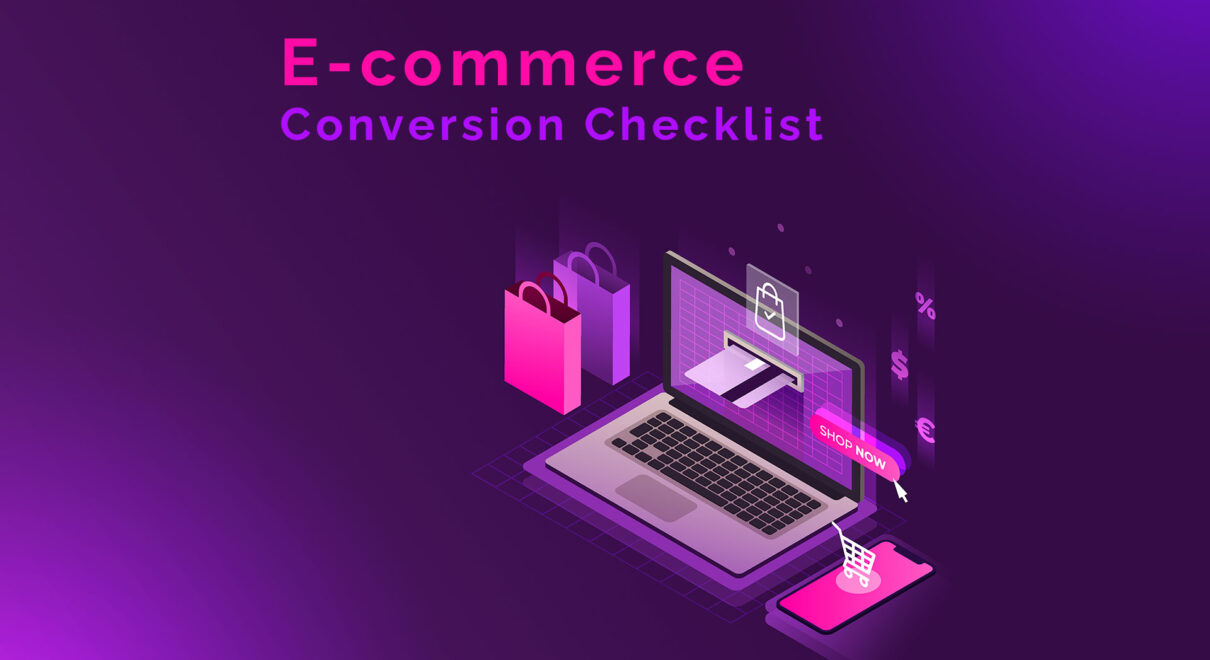
E-commerce has revolutionized the way people shop, making it more convenient and accessible than ever before. With the rise of online shopping, businesses have been forced to adapt to this new landscape and create e-commerce websites that meet the needs of their customers. However, creating an e-commerce website that converts visitors into customers is no easy feat. There are hundreds of critical conversion checkpoints that must be considered in order to create an effective e-commerce website.
In this blog post, we will provide a comprehensive e-commerce website checklist that includes over 300 critical conversion checkpoints across the following pages: home page, category page, product page, landing page, cart page, checkout page, and thank you page.
Home Page
The home page is the first page that visitors see when they land on an e-commerce website. It is the page that sets the tone for the entire site and should be designed to capture the visitor’s attention and encourage them to explore further. The following checkpoints should be considered when designing the home page:
- Clear branding: The home page should clearly display the branding of the company, including the logo and tagline.
- Navigation: The navigation menu should be easy to find and use, allowing visitors to quickly find the pages they are looking for.
- Search bar: A search bar should be prominently displayed on the home page, allowing visitors to search for products and services.
- Featured products: The home page should showcase featured products or promotions that are likely to capture the visitor’s attention.
- Social proof: Social proof, such as customer reviews or testimonials, should be prominently displayed on the home page to build trust and credibility.
- Call-to-action: The home page should include clear call-to-action buttons that encourage visitors to take action, such as “Shop Now” or “Learn More”.
Category Page
The category page is where visitors browse products based on specific categories, such as clothing, electronics, or home goods. The following checkpoints should be considered when designing the category page:
- Clear categorization: The products should be organized into clear categories that are easy to navigate.
- Filtering options: The category page should include filtering options that allow visitors to narrow down their search by size, color, price, and other relevant criteria.
- Product images: High-quality product images should be displayed on the category page, allowing visitors to see the products before clicking through to the product page.
- Product descriptions: Brief product descriptions should be displayed on the category page to provide visitors with basic information about the product.
- Sorting options: The category page should include sorting options that allow visitors to sort products by price, popularity, and other relevant criteria.
- Call-to-action: The category page should include clear call-to-action buttons that encourage visitors to click through to the product page, such as “View Product” or “Learn More”.
Product Page
The product page is where visitors learn more about a specific product and make the decision to purchase. The following checkpoints should be considered when designing the product page:
- High-quality images: The product page should include high-quality images that show the product from multiple angles.
- Detailed product description: The product page should include a detailed product description that provides visitors with all the information they need to make an informed purchase decision.
- Product options: If the product comes in different colors, sizes, or styles, the product page should include options for visitors to select their preferred option.
- Reviews: Customer reviews and ratings should be prominently displayed on the product page to provide social proof and build trust.
- Related products: Related products or accessories should be suggested on the product page, encouraging visitors to explore other products.
- Call-to-action: The product page should include a clear call-to-action button that encourages visitors to add the product to their cart or make a purchase, such as “Add to Cart” or “Buy Now”.
Landing Page
A landing page is a page that visitors arrive at after clicking on an ad or promotional link. It is designed to encourage visitors to take a specific action, such as making a purchase or filling out a form. The following checkpoints should be considered when designing a landing page:
- Clear headline: The headline should clearly communicate the purpose of the landing page and what the visitor can expect.
- Simple layout: The landing page should have a simple layout with minimal distractions, allowing visitors to focus on the intended action.
- Compelling copy: The copy on the landing page should be compelling and persuasive, encouraging visitors to take action.
- Relevant images: The landing page should include relevant images that support the message of the page.
- Testimonials: Social proof, such as customer testimonials, should be prominently displayed on the landing page to build trust.
- Call-to-action: The landing page should include a clear call-to-action button that encourages visitors to take the intended action, such as “Sign Up” or “Buy Now”.
Cart Page
The cart page is where visitors review the items in their shopping cart before making a purchase. The following checkpoints should be considered when designing the cart page:
- Clear summary: The cart page should provide a clear summary of the items in the cart, including the product name, price, and quantity.
- Product images: Small product images should be displayed on the cart page to help visitors easily identify the items in their cart.
- Coupon code: If there is an option to apply a coupon code, it should be prominently displayed on the cart page.
- Shipping information: The cart page should provide clear information about shipping options and costs.
- Cross-selling opportunities: Cross-selling opportunities, such as related products or accessories, should be suggested on the cart page.
- Call-to-action: The cart page should include a clear call-to-action button that encourages visitors to proceed to checkout, such as “Checkout Now”.
Checkout Page
The checkout page is where visitors enter their payment and shipping information and complete their purchase. The following checkpoints should be considered when designing the checkout page:
- Simple layout: The checkout page should have a simple and easy-to-follow layout, with minimal distractions.
- Progress bar: A progress bar should be displayed on the checkout page, showing visitors how far along they are in the checkout process.
- Payment options: The checkout page should provide clear information about the available payment options.
- Shipping options: The checkout page should provide clear information about the available shipping options and costs.
- Security information: Information about the website’s security measures should be prominently displayed on the checkout page to build trust.
- Call-to-action: The checkout page should include a clear call-to-action button that encourages visitors to complete their purchase, such as “Place Order”.
Thank You Page
The thank you page is where visitors are directed after completing their purchase. The following checkpoints should be considered when designing the thank you page:
- Order confirmation: The thank you page should confirm the details of the order, including the order number and expected delivery date.
- Follow-up instructions: Any follow-up instructions, such as tracking information or instructions for returning or exchanging the product, should be provided on the thank you page.
- Related products: Related products or accessories should be suggested on the thank you page, encouraging visitors to make additional purchases in the future.
- Customer support information: Contact information for customer support should be provided on the thank you page, in case the visitor has any questions or issues.
- Social sharing options: Social sharing options, such as sharing the purchase on social media, should be provided on the thank you page checklist:
- Personalized message: A personalized message thanking the visitor for their purchase can help build a relationship with the customer.
- Call-to-action: The thank you page should include a clear call-to-action button that encourages visitors to take the next step, such as signing up for a newsletter or following the company on social media.
Conclusion
In conclusion, designing an effective e-commerce website requires careful attention to detail and a comprehensive checklist of critical conversion checkpoints. By ensuring that the home page, category page, product page, landing page, cart page, checkout page, and thank you page are optimized for conversion, businesses can increase their chances of success in the highly competitive world of e-commerce. While every website is unique, the above checklist provides a solid foundation for creating a high-converting e-commerce website. By continually testing and refining their website, businesses can continue to improve their conversion rates and grow their online sales.