The dark theme UI for apps and websites is popular among many people. However, a survey revealed that 58% of U.S adults have experienced eye strain from using computers. To alleviate this issue, designers should be mindful of the shade of black they incorporate in their designs.
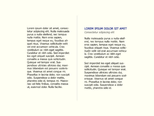
High color contrast is useful for readability. But, prolonged reading of pure black text on white backgrounds can cause eye strain to the user.
Stop Using Black in UI Design
There are several reasons why it is generally recommended to avoid using black as the primary color in UI design:
- Black can be hard to read on certain screens, such as those with low resolution or poor contrast.
- Black can make text and other elements difficult to distinguish from the background, which can lead to confusion and usability issues.
- Black can be overwhelming and make it difficult for users to focus on specific elements or tasks.
- Black can create a sense of formality, which may not be appropriate for all types of applications or websites.
- Instead of black, designers often use shades of gray for text and backgrounds, as it is more visually pleasing and easier to read.
However, it’s worth noting that there are also scenarios where black can be used as UI design element such as text color, icons, etc in certain cases like dark mode design, high contrast design, specific brand guidelines, etc. But it’s always good to be mindful of the above points while using black.
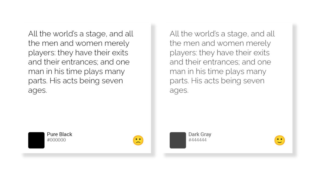
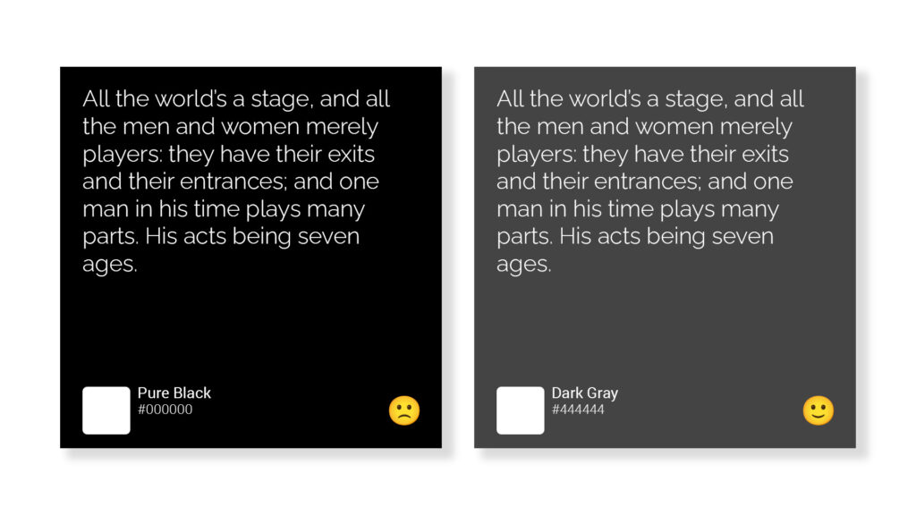
Pure Black Text Can Cause Eye Strain
Pure black text on a white background can cause eye strain, especially when viewed for long periods of time. This is because the high contrast between the black text and white background can be tiring for the eyes. This is why it’s common to see text that is not pure black, but rather a darker shade of gray, which is less harsh on the eyes.
Additionally, using a slightly warmer color temperature for the background can also reduce eye strain.
When Dark UIs Work Well
Dark UIs can work well in certain situations, such as:
- Low-light environments where a dark background can reduce glare and make it easier to see text and other interface elements
- OLED and AMOLED displays where dark pixels consume less power and can extend battery life
- Applications that are used primarily at night or in dimly lit environments
- Applications that are used for video and photo editing, as the dark background can reduce distractions and make it easier to focus on the content being edited.
- Applications where users are sensitive to bright light and prefer a dark UI
When Dark UIs Don’t Work Well
Dark UIs may not work well in certain situations, such as:
- Brightly lit environments where a dark background can make it difficult to see text and other interface elements
- Applications that are used primarily during the day or in well-lit environments
- Applications that are used for data visualization, where high contrast and bright colors are needed to effectively communicate information
- Applications that are used by people with visual impairments or color blindness, as low contrast and certain colors can make it difficult for them to see and use the interface.
- Applications that are used by people who are sensitive to low light and prefer a light UI
It’s important to note that while dark UI may not work well in certain situations, it’s not always the case. It’s always important to consider the context of use, user preferences, and readability before deciding to use a dark UI.
The Dos and Don’ts of Using Dark UIs
Dos:
- Do consider the context of use and user preferences when deciding to use a dark UI
- Do use high contrast and bright colors when necessary to effectively communicate information
- Do use darker shades of gray instead of pure black to reduce eye strain
- Do use a slightly warmer color temperature for the background to reduce eye strain
- Do test your dark UI with a diverse group of users to ensure it’s accessible and easy to use
Don’ts:
- Don’t use dark UIs in brightly lit environments where a dark background can make it difficult to see text and other interface elements
- Don’t use low contrast and certain colors that can make it difficult for people with visual impairments or color blindness to see and use the interface
- Don’t use dark UIs for data visualization where high contrast and bright colors are needed to effectively communicate information
- Don’t neglect to test your dark UI with a diverse group of users to ensure it’s accessible and easy to use
- Don’t ignore the user preferences and force dark mode on users without giving them an option to switch to light mode
You can use the colors below instead of pure black:
#303030 #2B2B2B #444444 #252525
If you’re unsure about your color contrast, you can visit coolors.co to calculate the contrast ratio of text and background colors.